
This map shows the percentage of Blacks in each county, with red symbolizing a greater percentage and yellow showing a greater percentage. According to the map, the counties with the greatest percentage of Blacks are found in the Southern United States which include Virginia, North Carolina, Alabama, Georgia, Louisiana, Arkansas, Mississippi, parts of Texas, and Washington D.C.. These are where most of the deep red counties are located, indicating that 53-86 percent of the population is Black. Additionally, light orange and orange counties are found around almost every major city, with percentages ranging from 8-25 percent. The less densely populated counties, namely rural areas from the Midwest, going west until Nevada, and areas far to the north such as Maine, Montana, North and South Dakota, and Minnesota show the lowest percentage of Blacks. For historical reasons, it makes sense that the South has so many counties that are predominately Black. It also makes sense for every urban area to have a greater percentage of Blacks because most of the United States population lives in urban areas.

This map shows the percentage of Asians in each county, with a deep purple color indicating a high percentage of Asians and a lighter purple color indicating a lower percentage. A higher percentage is seen around most major cities. The greatest concentration of Asians is found along the West Coast in California. As many of the first Asian-Americans arrived by boat, it would make sense for subsequent generations to establish the Asian-American community in California, around the Los Angeles and San Francisco, with percentages ranging from 10-48 percent. Other major Asian communities outside of California are found in New York City and Houston. Hawaii, not shown on the map, also has a high percentage of Asians.
 This map shows the percentage of "Other Race" in counties across the United States. The category of "Other Race" includes anyone who does not identify themselves as White, Black, Asian, or Native American. This demographic would most likely include the Latino and Middle Eastern populations. The greatest percentages of this demographic are found in California and the Southwest, especially along the Mexican border, making up as much as 39 percent of the population. Interestingly, high percentages are found in the less populous counties in Central California. I would guess that most of these counties are representative of the Mexican population, along with other Hispanic communities. Since Los Angeles is known for its significant Iranian and Armenian populations, these groups may also comprise a significant portion of the "Other Race" demographic. I am also guessing that the "Other Race" populations in Florida and New York may be composed of minority groups from Caribbean nations such as Haiti or Cuba rather than Mexicans.
I found these maps were very interesting and revealed much about how the various minority groups were distributed about the United States. When reading these maps, it is also important to note that each county has a different number of people within it. About eighty percent of the population lives in urban areas, so the best way to gauge the national percentage of a particular race is to look around the major cities. For African Americans, the national average is about 12 percent. Asian Americans make up about 5 percent of the national population, and Latinos make up about 15 percent of the population. It was interesting to see how drastically the demographics in counties across the country varied compared to California's. As the Census 2010 information is collected, it would be important to track any changes in these demographics from 2000.
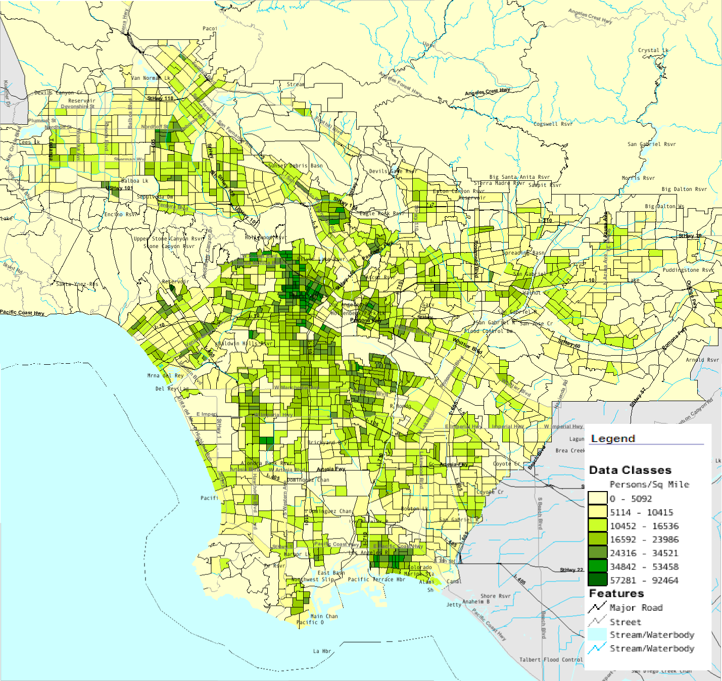
My experience with GIS has been challenging but was not without its rewards. From learning exactly what GIS was, to learning how to use ArcGIS, I came to understand both the complexity of utility of GIS. I was amazed to find all the publicly available information released by the USGS and Census Bureau which could be readily used by ArcGIS. I was interested in how spatial analysis could be used to produce quantitative data from both vector and raster data. I also liked how ArcGIS included tools to produce a professional layout, complete with legends and scale bars. Learning about GIS really made me appreciate how much work goes into gathering data and creating a map.


