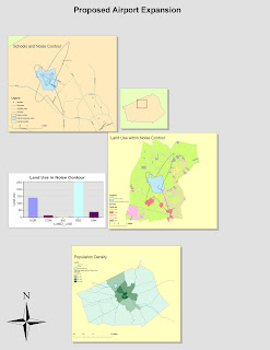
In my experience with ArcGIS, I've learned about both the complexity and power of this software. This software allows the user to create layered maps that are linked to a table of values. By drawing connections between these maps and values, valuable information can be extracted and graphed. For example, the contour line in the example represented noisy areas around an airport. Through commands in the software, it is possible to select land parcels that touch the contour as well as any that border those parcels. ArcGIS is able to specifically select sections of the map that the user wants to select. Because there is so much information linked to the set of spatial data, the user's selection criteria is limitless.
By giving the user so many ways to manipulate the data, ArcGIS tends to be complicated at times. The user would need to be very experienced with the software in order to utilize all of its functions. Unlike neogeography tools such as those provided by Google Maps, ArcGIS cannot be learned in a quick tutorial video. Even after going through the tutorial of ArcGIS, I would still need to repeat it several times before I understood what exactly I am doing at each step. Additionally, the software is very expensive and inaccessible to the general public. Instead, it is more suitable for professionals in urban planning, social sciences, ecological studies, or other fields which utilize spatial data.
I found that the most important thing I learned while using ArcGIS is the importance of spatial data. Through spatial data, the software is able to extract quantitative data. The resultant graphs from ArcGIS were crucial to drawing conclusions from spatial relationships and various values. The ability to select specific sections and layers, and then make a separate map out of it, was great for showing off spatial relationships. The noise contour from the tutorial exercise could potentially be useful for an urban planer who must present the information at a city council meeting to those trying to solve the issue of noise generated from the airport. ArcGIS provides an quantitative approach to solving such an issue.
The versatility of ArcGIS can also allow users to skew the information to argue a specific point. This is both a benefit and a potential problem to those who are not well informed about an issue. As I learned in lecture, every map has a bias stemming from what is included and what is not. As it is impossible to include everything in a map, the user is responsible to inputting the data into ArcGIS. By controlling the GIS data, the user will generate maps that only reflect the information that was chosen to be included. A biased map could potentially be a powerful argument tool. Similarly, a scientist trying to come to accurate conclusions about an issue would be limited to the pool of data that was gathered. As it is impossible to gather all the data available in the world, there would be a degree of error associated with any type of conclusion made.
Nice work. 9.6/10
ReplyDelete