Thursday, May 27, 2010

Week 8: Mapping the Station Fire


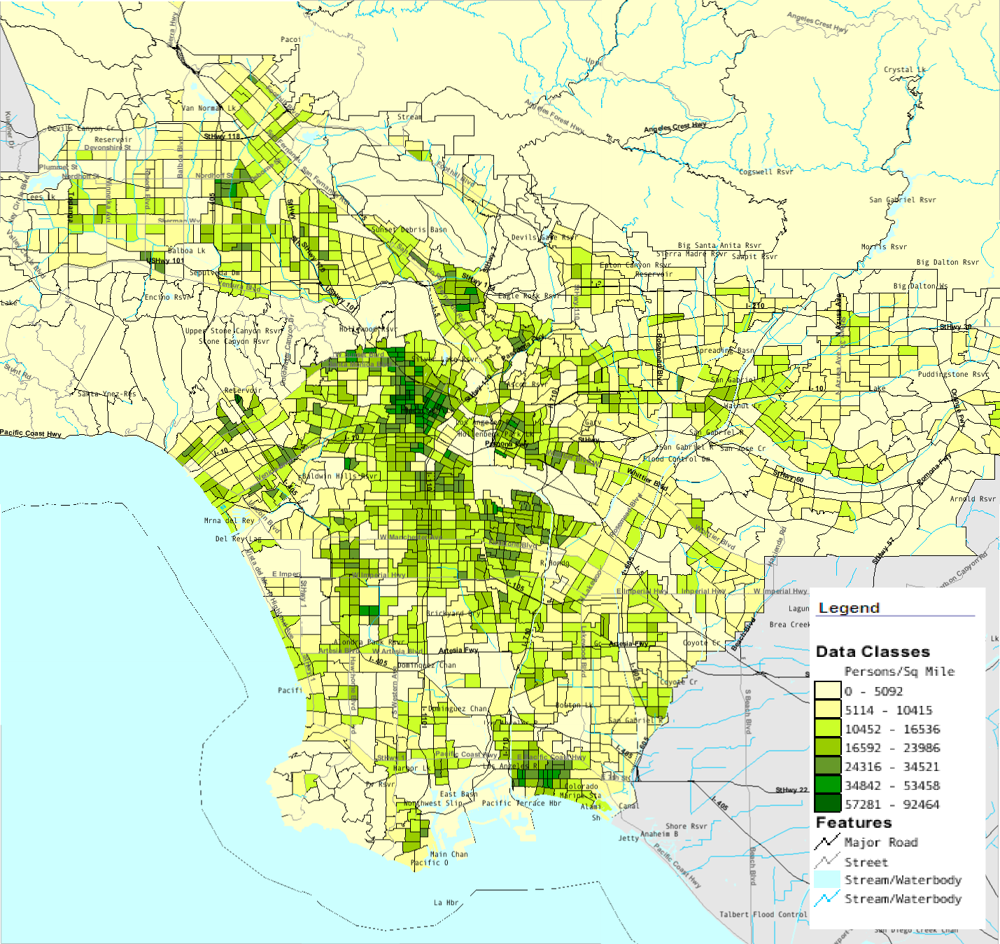
This week, I am using ArcGIS to create a map of the 2009 Station Fire, which I will analyze in terms of the damage caused to the burnt area and surrounding communities. My map includes the maximum area covered by the fire as it ran its course in the month of September. The burnt areas are represented by the orange area, layered over the green area representing the Angeles National Forest. In addition, I represented bodies of water in blue and major roads with red lines. I used a dataset of LA County cities to label my map with major communities so that the relative location of the fire can be more easily referenced. Lastly, I used DEM data to show the elevation gradient of land in brown because I found topographic information to be relevant to the spread of a natural disaster such as a wildfire. Additionally, I included a population density map showing that significant populations in the Pasadena, La Canada, and Glendale regions were in great danger at the peak of the wildfire.

The Station Fire of September 2009 posed a great danger to LA County before it was finally contained. It was the largest Los Angeles County wildfire ever documented. The fire started in late August and lasted through to mid October. Originating in the Angeles National Forest, the fire burned a total of 160,577 acres. The cost of fighting the fire reached over $93,779,000, which does not factor in the damaged and destroyed properties. In addition, the fire threatened the nearby cities to the south, and closed many roads going in and around the Angeles National Forest.

Though the fire started in the forest, nearby communities became threatened as the fire crept closer. The communities of La Canada Flintridge, Altadena, Glendale, Acton, and Palmdale had evacuation orders in anticipation of the fire. Unsure about whether the flames would engulf their community, residents halted their daily activities and braced for the worst. The La Canada and Glendale School Districts ordered school closures until it was deemed safe. Over 20,000 residents in La Canada alone were endangered by the Station Fire.

The forest which the fire started in experienced the most damage. Within the forest itself, an estimated 12,000 structures were threatened. Important wildlife habitats were also destroyed in the fire. Animals not killed in the fire were left homeless. By being forced out of their natural habitats, animals such as deer, bears, and mountain lions are prone to greater interaction with humans. This disturbs their natural way of living and can be detrimental to their species in the long run. Although wildfires occur naturally and pose potential benefits to the ecosystem, the scale of this wildfire makes it difficult for the ecosystem to recover from.

Overall, the fire destroyed over 200 properties. Of these, 89 were residential homes and 26 were commercial properties. An addition 57 properties were damaged in the Station Fire. 22 injuries and the death of 2 firefighters were caused by this fire. At the start of the fire, 3,655 people were assigned to fight the fire, using 400 fire engines, 10 air tankers, 8 helitankers, 5 helicopters, and 58 hand crews. Atop Mt. Wilson, numerous communications towers and multimillion dollar astronomy facilities were at risk, although these facilities were not damaged. Towards the end of its course, the Station Fire was determined to be a result of arson.

bibliography

Beltzer, Yvonne. "Station Fire Takes a Big Toll: Wildlife Habitat Lost." NBC Los Angeles. NBC, 04 09 2009. Web. 27 May 2010. .

Knoll, Corina. "TV signals from Mt. Wilson at risk." Los Angeles Times. Los Angeles Times, 31 08 2009. Web. 27 May 2010. .

"Station Fire evacuations." Daily News Los Angeles. N.p., 30 08 2009. Web. 27 May 2010. .

"Station Fire News Release." InciWeb. N.p., 31 08 2009. Web. 27 May 2010. .

"Station Fire News Release." InciWeb. N.p., 27 09 2009. Web. 27 May 2010. .

Willian-Ross, Lindsay. "Station Fire Update: Evacuations, School Closures & Other Info." LAist. N.p., 30 08 2009. Web. 27 May 2010. .


Wednesday, May 19, 2010

Week 7: DEMs


From top to bottom: Shaded relief map layered over a hillside model, slope map, aspect map, 3d rendering of my DEM

The DEM I have chosen is a 1" by 1" area of the Sierra Nevada Mountain Range within California, near Lake Tahoe. The extent of the map is 38.738 degrees North to 38.426 degrees North and -120.154 degrees West to -119.702 degrees West using the GCS North American 1983 coordinate system. Both the shaded relief map and 3d rendering show that the selected DEM contains many mountains and hills. The red represents higher elevations and the blue represents lower elevations, so by seeing the whole range of colors in the image I can tell that this region is very mountainous. The slope map appears to be mostly blue, a color used to show areas of high slope. This observation agrees with the steep nature of the terrain. Lastly, the aspect map color codes the DEM depending on which direction it is facing. As this is a mountain range, there is a homogeneous mixture of every color except for gray, which is used to denote flat regions.

Thursday, May 13, 2010

Week 6: Map Projections


Map projections aim to solve the issue of how a 3D globe can be accurately reproduced on a 2D surface. The importance of accurate cartography has prompted the creation of many types of projections, each with its own strengths and weaknesses. The maps I have created were made using six different types of map projections. In the first row, on the left, is a Mercator conformal projection, and on the right, is a WGS 1984 Web Mercator conformal projection. The maps in the second row display the Cylindrical Equal Area projection and Sinusoildal Equal Area projection on the left and right, respectively. In third row, the map on the left is a Plate Caree Equidistant projection and the map on the right is a Equidistant Cylindrical projection.

Conformal maps, by definition, have longitude and latitude lines that intersect at 90 degree angles and therefore preserve local angles. These types of maps are useful for preserving direction. However, the projection distorts distance as you move away from the equator. In the Mercator projection, the distance between Washington D.C. and Kabul, Afghanistan was measured at 16,290,029 meters. In the WGS 1984 Mercator projection, the distance was 16,155,109 meters.

The equal area projections, as the name implies, aims to preserve the relative areas of all the countries on the map. This is useful for subjects like ecology and meteorology where the area something occupies is relevant. Getting an accurate measure of area is essential to extrapolation and drawing conclusions about an affected population in the area. In the Cylindrical Equal Area projection, D.C. and Kabul are 15,985,172 meters apart. This projection also preserves direction at the cost of being stretched out lengthwise. The Sinusoidal Equal Area map shows that D.C. and Kabul are 13,230,876 meters apart. This map is distorted to preserve the spherical shape and distance of a globe, but the direction is not preserved.

The equidistant map projections are used when distances are important, such as in airline navigation. Distances are preserved in respect to a chosen reference point on the map, which is usually the equator or a longitude line. The Plate Caree Equidistant projection spaces out circles of latitude evenly along a rectangular grid. By doing so, the projection distorts area and direction. According to this projection, D.C. and Kabul are 16,367,464 meters apart. The Equidistant Cylindrical projects the globe cylindrically along a longitude line. This causes the North-South distances to be stretched and the East-West distances to be compacted. In this map, D.C. and Kabul are only 8,145,837 meters apart. Equidistant map projections are especially important for calculating trajectories and weapon ranges in the military.

Thursday, May 6, 2010

Week 4: ArcGIS


In my experience with ArcGIS, I've learned about both the complexity and power of this software. This software allows the user to create layered maps that are linked to a table of values. By drawing connections between these maps and values, valuable information can be extracted and graphed. For example, the contour line in the example represented noisy areas around an airport. Through commands in the software, it is possible to select land parcels that touch the contour as well as any that border those parcels. ArcGIS is able to specifically select sections of the map that the user wants to select. Because there is so much information linked to the set of spatial data, the user's selection criteria is limitless.

By giving the user so many ways to manipulate the data, ArcGIS tends to be complicated at times. The user would need to be very experienced with the software in order to utilize all of its functions. Unlike neogeography tools such as those provided by Google Maps, ArcGIS cannot be learned in a quick tutorial video. Even after going through the tutorial of ArcGIS, I would still need to repeat it several times before I understood what exactly I am doing at each step. Additionally, the software is very expensive and inaccessible to the general public. Instead, it is more suitable for professionals in urban planning, social sciences, ecological studies, or other fields which utilize spatial data.

I found that the most important thing I learned while using ArcGIS is the importance of spatial data. Through spatial data, the software is able to extract quantitative data. The resultant graphs from ArcGIS were crucial to drawing conclusions from spatial relationships and various values. The ability to select specific sections and layers, and then make a separate map out of it, was great for showing off spatial relationships. The noise contour from the tutorial exercise could potentially be useful for an urban planer who must present the information at a city council meeting to those trying to solve the issue of noise generated from the airport. ArcGIS provides an quantitative approach to solving such an issue.

The versatility of ArcGIS can also allow users to skew the information to argue a specific point. This is both a benefit and a potential problem to those who are not well informed about an issue. As I learned in lecture, every map has a bias stemming from what is included and what is not. As it is impossible to include everything in a map, the user is responsible to inputting the data into ArcGIS. By controlling the GIS data, the user will generate maps that only reflect the information that was chosen to be included. A biased map could potentially be a powerful argument tool. Similarly, a scientist trying to come to accurate conclusions about an issue would be limited to the pool of data that was gathered. As it is impossible to gather all the data available in the world, there would be a degree of error associated with any type of conclusion made.